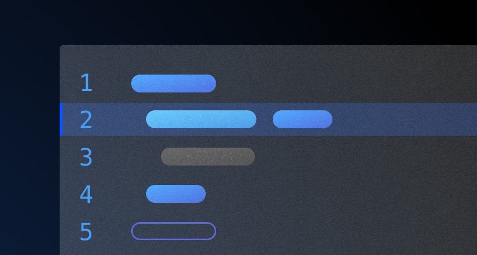
The Code Editor is used to edit or create code snippets.
Usage
When to use
- When providing an interactive environment for users to write and edit code.
- When syntax highlighting and code formatting are essential for the user experience.
When not to use
- As a simple display for static code snippets.
- As an embedded terminal or terminal emulator.
When to use a Code Editor vs. a Code Block
There is some overlap in the functionality of the Code Editor and the Code Block. Which to use generally comes down to the need for interactivity and user input.
Use a Code Editor:
- If editing or writing code is the primary purpose.
Use a Code Block:
- If viewing or displaying code is the primary purpose, and editing is not needed.
- If providing an example which consists of static code snippets or commands.
Header
Use a title and/or description in the header to provide additional information, instructions, or to label a Code Editor. Both of these yielded subcomponents are optional, but including them can help to provide additional context about a specific block of code.

When not to use a header
There can be an overlap between content that you may choose to include in the header as a title or description, and content that is part of the normal layout flow in a headline or paragraph. If it is necessary to elevate this content in the hierarchy of the page, we recommend including it in the normal layout flow, rather than as a title or description within the Code Editor.

How to use this component
The basic invocation doesn't require any arguments.
<Hds::CodeEditor />
Title and description
Optionally, you can pass a title and/or a description.
CodeEditor title
CodeEditor description
<Hds::CodeEditor
  @language="sql"
  @value="SELECT * FROM TABLE"
as |CE|>
  <CE.Title>
    CodeEditor title
  </CE.Title>
  <CE.Description>
    CodeEditor description
  </CE.Description>
</Hds::CodeEditor>
Title tag
The @tag argument changes the HTML element that wraps the [CE].Title content. When organizing the content on a webpage, the heading levels should reflect the structure of the page. For example, if a CodeEditor is within a subsection of the page below a heading level 2, the value should be "h3".
Learn to write functions in JavaScript
Functions are a critical part of learning JavaScript. They are reusable chunks of code that can perform tasks like convert an object to an array.
convertObjectToArray.js
<div class="doc-code-block-demo-heading">
  <Hds::Text::Display @tag="h2" @size="300">Learn to write functions in JavaScript</Hds::Text::Display>
  <Hds::Text::Body @tag="p">Functions are a critical part of learning JavaScript. They are reusable chunks of code that can perform tasks like convert an object to an array.</Hds::Text::Body>
</div>
<Hds::CodeEditor
  @language="javascript"
  @value="function convertObjectToArray (obj) {
  let arr = Object
    .keys(obj)
    .map(key => {return [key, obj[key] ]})
    .flat()
    .sort()
  ;
  return arr;
}" as |CE|>
  <CE.Title @tag="h3">
    convertObjectToArray.js
  </CE.Title>
</Hds::CodeEditor>
Language
The language argument sets the syntax highlighting used. We only support the following languages: javascript, json, sql, and go. If you need additional languages contact the Design Systems Team
<Hds::CodeEditor
  @language="go"
  @value="package main
import fmt
func main() {
  fmt.Println(helloWorld)
}"
/>
Copy button
Set hasCopyButton to true to display a button for users to copy CodeEditor content to their computer clipboard.
<Hds::CodeEditor
  @language="javascript"
  @hasCopyButton={{true}}
  @value="let codeLang=`JavaScript`;
console.log(`I am ${codeLang} code`);"
/>
Component API
This component uses CodeMirror under the hood.
CodeEditor
<[CE].Title>
yielded component
ContentBlock::Title yielded as contextual component (see below).
<[CE].Description>
yielded component
ContentBlock::Description yielded as contextual component (see below).
value
string
CodeEditor.
language
string
- go
- javascript
- json
- sql
hasCopyButton
boolean
- false (default)
Contextual components
[CB].Title
The CodeEditor::Title component, yielded as contextual component.
yield
strong, em, a, code/pre. Consumers will need to style other HTML tags if used as children.
tag
enum
- p (default)
- h1
- h2
- h3
- h4
- h5
- h6
…attributes
...attributes.
[CB].Description
The CodeEditort::Description component, yielded as contextual component.
yield
strong, em, a, code/pre. Consumers will need to style other HTML tags if used as children
…attributes
...attributes.
Anatomy

| Element | Usage |
|---|---|
| Title | Optional |
| Description | Optional |
| Copy button | Optional |
| Toggle fullscreen button | Optional |
| Code snippet | Optional |
Syntax highlighting
To aid in understanding how the highlighting theme is applied via Prism's tokens, we've provided a high-level, non-exhaustive list of token names and how they might be applied depending on the syntax.
| Color | Usage |
|---|---|
| Cyan | Property, url, or operator |
| Blue | Function, builtins |
| Orange | Strings, characters |
| Purple | Booleans, numbers |
| Green | Keywords, class names, saving the world |
| Red | Important items |
| White | Default color within the code block, also used for punctuation (<, { }, =, etc) |
| Gray | Used for comments across languages |
Working directly with an engineering partner can reveal exactly how a snippet will render in the component and should be the first course of action when creating custom snippets.
If you have questions or need assistance creating custom examples, contact the Design Systems Team for support.
States
Focus with header content

Focus without header content

Conformance rating
When used as recommended, there should not be any WCAG conformance issues with this component.
Applicable WCAG Success Criteria
This section is for reference only. This component intends to conform to the following WCAG Success Criteria:
-
1.3.1
Info and Relationships (Level A):
Information, structure, and relationships conveyed through presentation can be programmatically determined or are available in text. -
1.3.2
Meaningful Sequence (Level A):
When the sequence in which content is presented affects its meaning, a correct reading sequence can be programmatically determined. -
1.4.1
Use of Color (Level A):
Color is not used as the only visual means of conveying information, indicating an action, prompting a response, or distinguishing a visual element. -
1.4.10
Reflow (Level AA):
Content can be presented without loss of information or functionality, and without requiring scrolling in two dimensions. -
1.4.11
Non-text Contrast (Level AA):
The visual presentation of the following have a contrast ratio of at least 3:1 against adjacent color(s): user interface components; graphical objects. -
1.4.12
Text Spacing (Level AA):
No loss of content or functionality occurs by setting all of the following and by changing no other style property: line height set to 1.5; spacing following paragraphs set to at least 2x the font size; letter-spacing set at least 0.12x of the font size, word spacing set to at least 0.16 times the font size. -
1.4.3
Minimum Contrast (Level AA):
The visual presentation of text and images of text has a contrast ratio of at least 4.5:1 -
1.4.4
Resize Text (Level AA):
Except for captions and images of text, text can be resized without assistive technology up to 200 percent without loss of content or functionality. -
2.1.1
Keyboard (Level A):
All functionality of the content is operable through a keyboard interface. -
2.1.2
No Keyboard Trap (Level A):
If keyboard focus can be moved to a component of the page using a keyboard interface, then focus can be moved away from that component using only a keyboard interface. -
2.4.3
Focus Order (Level A):
If a Web page can be navigated sequentially and the navigation sequences affect meaning or operation, focusable components receive focus in an order that preserves meaning and operability. -
2.4.7
Focus Visible (Level AA):
Any keyboard operable user interface has a mode of operation where the keyboard focus indicator is visible. -
4.1.2
Name, Role, Value (Level A):
For all user interface components, the name and role can be programmatically determined; states, properties, and values that can be set by the user can be programmatically set; and notification of changes to these items is available to user agents, including assistive technologies.
Support
If any accessibility issues have been found within this component, let us know by submitting an issue.
4.15.0
Added
Added the Hds::CodeEditor component.

